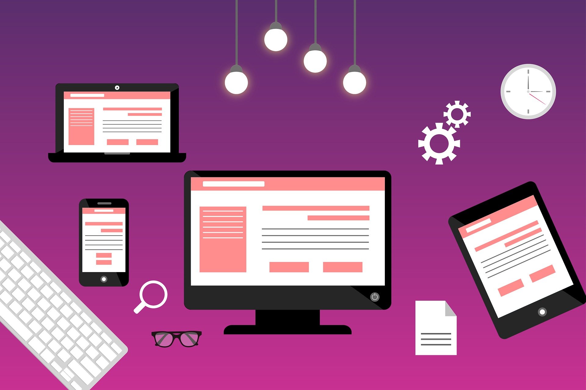
Web design of our time is a lot of opportunities. But not every fad is viable in a certain period. There is a time and place for each approach. “Overhauling” a website for no reason can do more harm than good.
But in 2021, such reasons will be more than enough. The analysis of user’ wishes shows that they want to see something new in web design. Therefore, today is the time to track new trends and use them on your website.
Alsi check – affordable website packages Perth.
What trends will be purely aesthetic in nature? What needs to be changed to improve the user experience? What trends will become a thing of the past and what will replace them? We have compiled a list of innovative web design trends for 2021, so that you are ready for changes.
Flexible Vector Graphics
The main source of aesthetics on any website is multimedia. A web page that contains interesting illustrations or photos is always rated higher.
Previously, websites with rich content took significantly longer to load, especially on mobile devices. But Google has made it clear that it cares about the user. One of the ranking criteria is the results of indexing sites on mobile devices.
This has made adaptability more in demand than even a year ago. The problem with GIF animations and PNG images is that they lose quality when resized. To abandon them means to kill the saturation. A way out of the situation and a new trend-vector illustrations.
SVG format allows you to scale the image to fit the screen, while maintaining the quality of the original graphics. Now this format will be a critical trend in both adaptability and web design in general.
Focus on Data
The user began to trust the analytics and its results more and more. Therefore, IT leaders strive to increase the role of informative design structures. As such, they are increasingly focused on design that focuses on project data.
First of all, this design will help you personally compare your company’s data. This way you can make important decisions faster. Similarly, this approach is a great opportunity to keep the reader on the page. Search engines want the user to spend as much time on the site as possible. After all, this increases the indexing rating.
To develop such a design, your team should focus on the following areas:
- intelligent data management and placement;
- configuring data sources;
Planning a data-driven design requires taking into account different business factors. This way you can back up your analytics with specific events.
Data as part of web design is communication with your users. Accordingly, this approach can revitalize your project.
Asymmetric Layouts
For many years, websites have been built on a grid. This is a great approach that helps to streamline the structure and focus on the key elements. On the other hand, it reduces the uniqueness of the site. Therefore, the upcoming trend is an asymmetric design.
Asymmetry is an opportunity to change traditions and move on to brutalism, individuality, shaky energy, and just plain fun.
However, even here, designers need to find a balance. To create a sense of balance, you need to conduct user testing. The goal is to make sure that no part of the page looks “heavier” than the rest. For example, an image should not be significantly larger than a text block.
You’re probably wondering, “How do I draw attention to the key elements if I don’t place them in a grid?” Here it is important to remember that regardless of the approach, the viewer’s eye is always focused on the large elements. Thus, in an asymmetric design, it is enough to simply increase the size of the blocks that you want to focus on.
Soft Shadows and Floating Elements
One of the best ways to attract the user’s attention is to upload a video to the background of the home screen. But today, technology still allows you to combine this approach with high page loading speed. This is especially true for mobile devices. The question remains: how to use SVG illustrations and at the same time ensure the volume of images?
The answer lies in the use of soft shadows and floating image elements. They make web design multi-layered and more interesting. In addition, it increases the depth of the design elements.
This effect can be used for decoration:
- main text;
- headlines;
- individual images and illustrations;
- active buttons;
In other words, you can add shadows and floating effects to any web design element. The main thing is that it looked aesthetically pleasing against the general background. Thanks to this approach, designers will be able to dilute the uniformity of SVG illustrations and make the design more unique.
Mixing Photos and Graphics
The use of real photos mixed with illustrations or graphics creates an individual message of the site. Whether you take a photo of a product or a person, it will help maintain your branding. Plus, it’s a great way to make a site stand out from the crowd.
- Overlaying or overlapping graphics with a photo creates a special visual effect.
- Such collages are universal:
- They can be used to add appeal.
- They dilute complex attributes, which allows you to convey abstract concepts.
- It’s a way to customize images and add personality.
How to use the flexibility of this trend to the maximum? Choose the style of illustrations and graphics to match the brand’s personality. This greatly affects how the user will interpret the photos. Eg:
- for a playful photo in the field of entertainment, you can choose caricature graphics;
- for an online store of classic clothing, complex geometric shapes are suitable;
- restaurant websites can be perfectly combined with retro-style graphics.
Conclusion
Many expected that 2020 would mark a change. But in fact, it was a year of analyzing new user requirements. We will see the results in 2021. Web designers will change most trends, making websites look completely different.


